Honk was first conceived around 2008, when I got the new iPhone on my hand, and downloaded the first SDK for it. At that time, I had envisioned it to be just a simple alarm with a set of fanciful GUI elements. I came with a background in Cocoa/OpenGL development for my scientific research, but was new to the mobile app development, and it would offer a way to teach myself how to make an App. There was also an aesthetic impulse in choosing this topic: However hard you try, when you look at those ubiquitous parking meters, you cannot induce any trace of visual pleasure from their design. Ditto about most of the parking garage buildings. So, my primary objective would be to make an App that would help offset this yuk-feeling a driver starts his day with after having parked his car somewhere.
Over the course of two weeks that followed, I managed to finish its basic algorithms, but only to realize that the iPhone OS did not offer any way to allow alarms to work in the background. There was the notion of a remote push-notification service to arrive soon, and I briefly looked into what it was promising. An app such as Honk makes or breaks depending on its timely operation within minutes' (even seconds!) accuracy. It seemed, therefore, somewhat ridiculous (or very cool for some!) to have your parking alarm to travel across the continent and be sent back from a 3rd-party server which wouldn't care less for what's at stake at your end.

Finally, as iOS acquired the (limited-)multitasking capability, it was now time to finish the project. By then, I had solidified the idea that it should also have an elegant and simple way to mark your parking spot. Personally, I have suffered as much annoyance forgetting the parking spot as from being caught by the meter officer too many times.
Given all those creative ways that garage owners use to mark their walls across the globe, using pre-set dials is not the best way to go, even though it would be the easiest to implement. It occurred to me that a simple voice recording would meet all imaginable need while requiring a minimal user interaction. But I hate my voice. Furthermore, I find it awkward for an otherwise sane-looking person to whisper into the phone while staring at it. And what if you are hiding behind a car in a dark garage, a gangster on your tail, and desperately need to mark your spot silently in case you will manage to come back to your car? Having ruled out the picker (dials), voice recording , and typing for reasons legitimate and imagined, I figured that the hand-writing is the simplest and most versatile option. A decision that ate away several weeks of my development time eventually. But I am glad I made that choice. I am digressing. Back to the design of the main gui....
It is not very motivating to code without any visual feedback. So, early on, I did "programmer's design" of what ideal that was in my head. At this point, Honk was going to feature a randomly chosen-, quirk but cute animation to zip across the sky whenever the user sets the meter. That looked pretty good. But many of the GUI elements in my design received criticism from my testers. Especially, the big round button at the bottom. Apparently, the metal sheen and the bevels hastily lifted off the Photoshop book were not quite up to standard...Despite these, the mechanics of its operation seemed good enough to indicate that something of commercial value was being made.
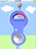
So, while I was polishing the algorithms to make the hand-writing work smoothly (this turned out to be much harder than I thought, largely due to the hardware limitations of iPhone 3Gs, and even 4G. Maybe a subject on its own for later. Had it not been for the iPad app, Penultimate, which was clearly showing that it can be done, I probably would have given up at some point.), I also contacted my son, Phill, asking for recommendation for a good designer to work with. Phill had gone through this kind of process quite successfully ("Classics for iPhone"). So far, I was being lazy in that the meter was using the vanilla slider object in an invisible mode, and dragging a rectangular view across another. If I were to hire a professional designer for the GUI, I thought, I should up the ante for myself too. So, I started the messy process of destroying and rebuilding the way the main dial works. Here is how it looked at that point. For a while, I just worked with skeletons and googled images. I focused more on the seamless working of the operations which involved threads, timers, queues, etc. Along the way, I learn that it is important to abandon an early effort and free yourself of burdens, especially if that was not your cup of tea to begin with. Enter Daniel Goffin, a young graphic designer that my son recommended. When we were starting, I still expected that Honk will keep the fanciful animations as its main GUI attraction. So, here is an example of what I initially communicated to Daniel to help him get in the right mood:
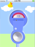
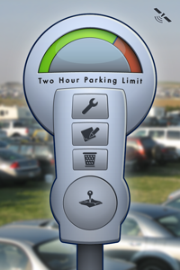
I recall it was Phill who had suggested in passing that we should use a blurred background instead of my original and brilliant conception of the flying ducks and sheep. Daniel also joined him. Even though I had a bit of trouble in giving up the rare chance to share my quirky sense of humor with the world, I was eventually persuaded. It pays to listen to what your son says. Nonetheless, I still believe it an opportunity lost when I look at the sketch that was to indicate an expiring alarm via the Snowy chasing off the parking meter officer... I so much wanted to have Honk help release the anger we all feel toward these impossible ladies! But the gain from listening to the veterans far outweighed this imagined loss: One thing I immediately noticed was that the graphics designers make their creations big and project more prominent presence. I am more of a muted, self-effacing school and tend to make all my buttons too small. But Daniel immediately established his newly designed meter square and centre in the main view of Honk. Naturally! I wouldn't object as long as the result looks gorgeous.
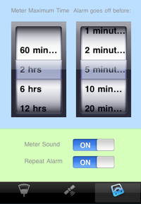
The image on the left shows my original design for the Settings view in which I used the vanilla buttons and the Picker elements, as well as the default font. On the right, we have Daniel's first design for the same, in which he replaced all aspects of the design elements down to the font to be used. As it turned out, the current iOS SDK does not allow even the simple switching of fonts for many of its parts, nor the color. To remain faithful to Daniel's aesthetics (which I also shared), I had to pay the price of making my own class of switch buttons as well as turning all text elements into separate view objects, which entailed many adverse side-effects...;-( To give myself some credit, I firmly believe in getting the small details right. So, I persevered and put in the necessary labor. As a result, Honk has some 220+ custom images, quite a bundle for a small utility app.
The only serious objection I had was the tone of the gray, which looked too dark and uniform. The meter itself and overall interface eventually became brighter. We also decided to minimize the space taken up by the row of buttons at the bottom in each view. To do so, we had to sacrifice the main navigation button in each view that allowed users to access directly other functionality of Honk. Instead, the final design uses the meter view as its hub, which works out fine for majority of users. Phill also forced me to spend good amount of time and effort to fix the logistics of views in their sliding up and down, teaching his physicist dad about how doors work in the non-Escheresque real-life world... ;-)
By the Thanksgiving day of 2010, Honk was gaining its final shape. We settled on the main meter design, and most of my fanciful ideas about animations, flying shark fins a la Jaws, barking dog sound as its main alarm, etc, had been filtered out by the pros. We also decided to save the nearby-feature for a later version, lest its designing process should further delay the launch. We were hoping for pre-Christmas launch, as we firmly believed that everybody in the world would want a parking meter app for their present. I also believed that only it would single- handedly save the world from the impending Depression.
Daniel and I got along very well: the strongest disagreement between us was about the color scheme of the meter dial. I am more for the cobalt-purple kind of guy (as shown in the figures below among the rejects), but he thought it should use the bright green and the orange, partly to be consistent with his design on the Settings view, but more for the traffic light metaphor he had in mind.
Once we decided to use blurred real life images as its background, it occurred to me that it would be fun if Honk alternates between a pair of images depending on whether the app is open during the day or the night time. Then, why not for every hour? I realized that finally the moment has arrived that will justify all the money spent to update my digital cameras!
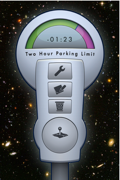
One thing I noted was that when you take pictures, you tend to put most interesting thing in the middle. In our case, the meter obscures most of it, so a typical picture is not very useable. From thousands of photos I amassed over the years of my life, I managed to cull about 60 that would look OK. (By now, I acquired the strange tendency of avoiding the center of the scene when I take pictures.) The following are among those that didn't make the cut for one reason or another:
The Hubble telescope picture which makes an awesome scene, I was not sure whether NASA would allow it, and there is no way to trick anybody into believing that I shot it. It was not a terrible loss though: the funny thing about our scheme of hourly background images that I hadn't realize until the very end was that nobody would feed the parking meter deep into the night when such image becomes relevant. So who cares but a detail-obsessed developer...? The one in the middle (taken from a street vendor in Paris) seemed too trying to be provocative with its cigarette ad, images of Lenin and McDonald sign (obscured by the meter). The third one, I was just afraid Apple may reject the app.
The following images that were also dear to me had to be ruled out: With the parking meter replacing the guy being hugged, it made the woman look rather sick. The middle one is reserved just in case Mercedes might recognize Honk as an advertisement opportunity. (BTW, my title for the picture is "Bully".) The third one, the image of a beautiful girl I chanced upon in the Cloister museum in Manhattan, could not be used as I do not have her permission to use. (Just in case: if you think you are this girl, and wouldn't mind helping a well-meaning, but can't pay indie developer, please contact.)
All images were blurred using Photoshop, but having devised an efficient image-blurring filter routine now, I am considering allowing user-taken images to substitute for the background in a future update. I am mindful, however, that it takes some effort to make images look attractive when there is this big phallic object in the middle. So the question is : do I really want it? It is one of the most often mentioned requests from users though....
By now, you may be thinking: Hell, it is all about superb GUI design that makes Honk what it is.... Well, given all the limitations of the platform and the scope of user expectation, a strong interface design is among the most critical components for sure. And we haven't touched on its icon design, another critical part, yet. However, having said that, I should also point out Honk has quite a few significant algorithmic innovations hidden behind its operation. But I cannot reveal them all under the watchful eyes of the mean competition in this small pond that is the Navigation section of the App Store these days. Speaking of mean competitors.... well, that's for only those of you who can stomach such things. I have more worthy subjects that I want to share. How about the icon design?







No comments:
Post a Comment