To continue on the evolution of Honk design, I will share how its icon design progressed. My experience tells me that it doesn't make too much sense to worry about the icon at too early a stage in the development of an App. Most likely, the app will go through many stages of drastic changes, add or drop features, and may even end up as something quite different from what was originally intended. If you spend too much effort into a pre-mature icon, and develop strong attachment to it, it will not only limit the way the app will evolve, but may end up as the wrong icon sitting on an otherwise excellent product. (Of course, the reverse may be true, I should add.)
It is obvious that the app icon should play a very critical role in attracting potential users' attention. Given how many times these icons imprint themselves on the phone user's mind everyday, a good icon design not only helps your sale but also mental well-being of general public. So it is a matter that needs be approached not casually.
It just happens that I am not a kind of person to whom the perfect icon materialize fully formed in the deep recess of the brain. On one hand, I was hoping that by the time the app is finished, at least a good idea may naturally come. On the other hand, I was jealously ogling at these apps which seem to have the perfect icons for what they do. My favorites include Bump, Classics (Of course!), Doodle Jump and Twitter. They are not only visually attractive, but also capture the essence/spirit of the app in the most economical way. And I wanted that kind of icon for Honk.
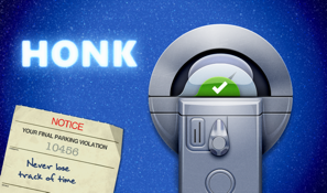
If you read my previous post, you know about the original character of the app that I started with. So, for most of its development, the working icon was the one that I just lifted off my initial design of the meter. It is not very polished, but I thought it captures the playfulness of the flying superman, ship, etc in its cartoon cloud while conveying the practical functionality of the app through the blue and metallic head of the meter with its austere geometry. So well into early November of 2010 (Honk v1 was released in Jan 12, 2011), this was its icon in my mind. The casual way it looks was constantly influencing small coding decisions I make. I can almost say that most of the unprofessional touches in the app that remain were devised under its influence.
As the app matured in its tone and as it acquired more refined UI designs nearing its launch, we started to think seriously about the icon. I tried to nudge Daniel to come up with something on par with Google Voice or Twitter involving a semi-abstract depiction of a parking meter. Despite several iterations, however, I couldn't convince myself whether that was the right direction.
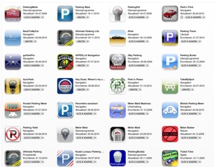
We even had the candidate icon sit side by side with the competition in a mock up App Store rendition : While I feel that any of Daniel's versions at this stage was already superior to most of the icons in this list, we were not quite there. Frankly, I felt that the icon of Auto Park stood out among this crowd, and I decided that I will not be satisfied until our design tops it. One aspect that makes this game challenging and intriguing is that it involves the delicate balancing between the grab-attention and the durable-attraction factors. They are not necessarily compatible, and of course, the third axis is the constraint imposed on you : in our case the consistently ugly object that is the parking meter. Turning it into an semi-abstract form seems to alleviate the problem, but I felt that it was failing to meet the base need of eyes looking for an explicit eye candy. Maybe I was still looking for the fancifulness that I had started the project with. I briefly toyed with the idea of totally abandoning the constraint of having the meter image at all. But, by then, we were facing another crisis : we realized that all imaginable names containing parking, meter, alarm, etc had been taken up! [I may elaborate on this issue in a separate blog] So, removing the core image off its icon seemed too cruel to it.


No comments:
Post a Comment